
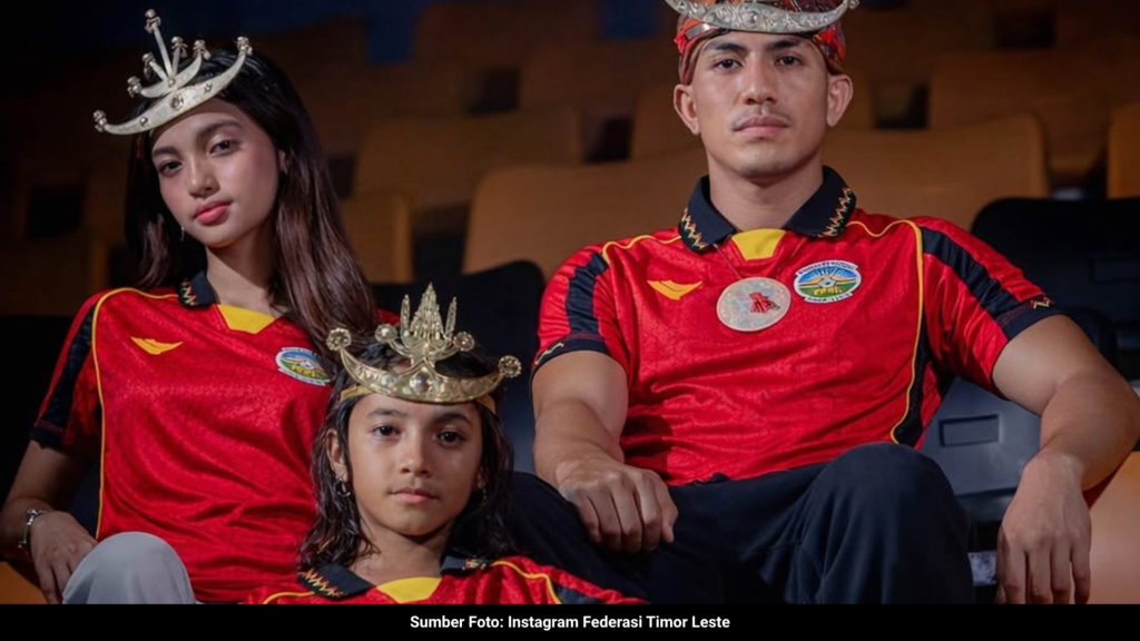
While the conversation around the regional heavyweight’s kits remains stuck in a loop of safe templates and uninspired execution, a massive flex just arrived from across the border. Timor Leste quietly completed their matchday lineup this season. Following the release of their crisp white away shirt, the nation just dropped a deep, blood-red home kit.
The real story here is the manufacturer. Engineered by Oliver, an independent sportswear label hailing from Sukoharjo, Central Java, this drop is a resounding statement. It proves that local talent can execute world-class football tailoring. It also serves as a sharp, elegant reality check for the much larger federation next door. While their neighbors settle for generic, mass-produced designs, Oliver just handed Timor Leste an absolute grail.
Here is the visual breakdown of how Oliver executed this crossover.
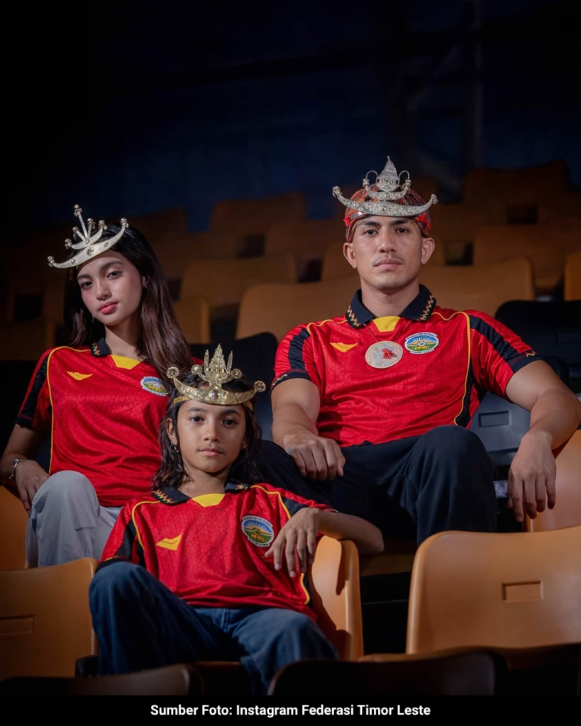
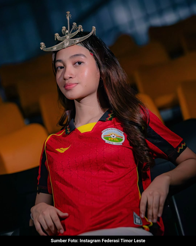
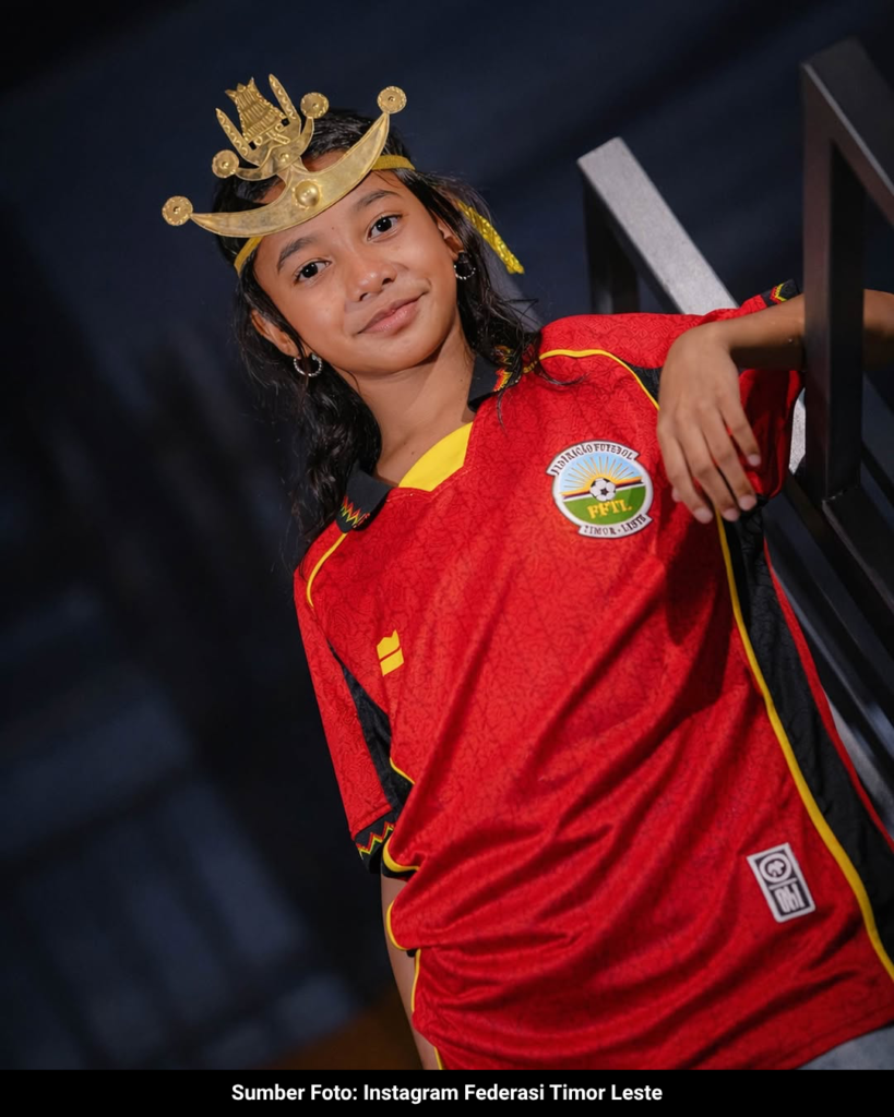
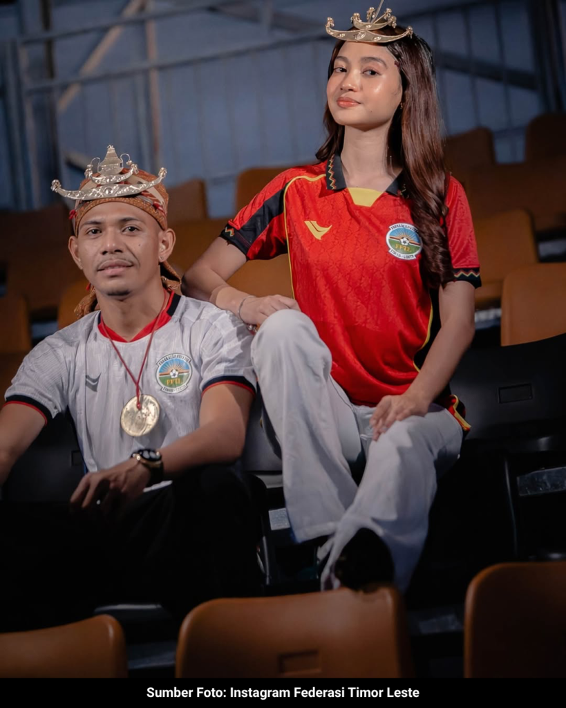
The Red Home Kit: A Geometric Mystery
This is not just another red performance shirt. Oliver wrapped the entire silhouette in a complex, tonal red sublimated pattern. There was no flashy press release dictating exactly what the graphic means, and that is exactly why it works. The brand let the intricate, woven-style geometric motifs do the talking.
The design radiates a deep, indigenous-inspired energy that translates flawlessly onto modern athletic fabric. By leaving the pattern unexplained, it gives the shirt incredible visual depth and a sense of mystique. A classic V-neck collar and cuffs, subtly tipped in national colors, anchor the bold graphic base. It is a bespoke piece of tailoring.
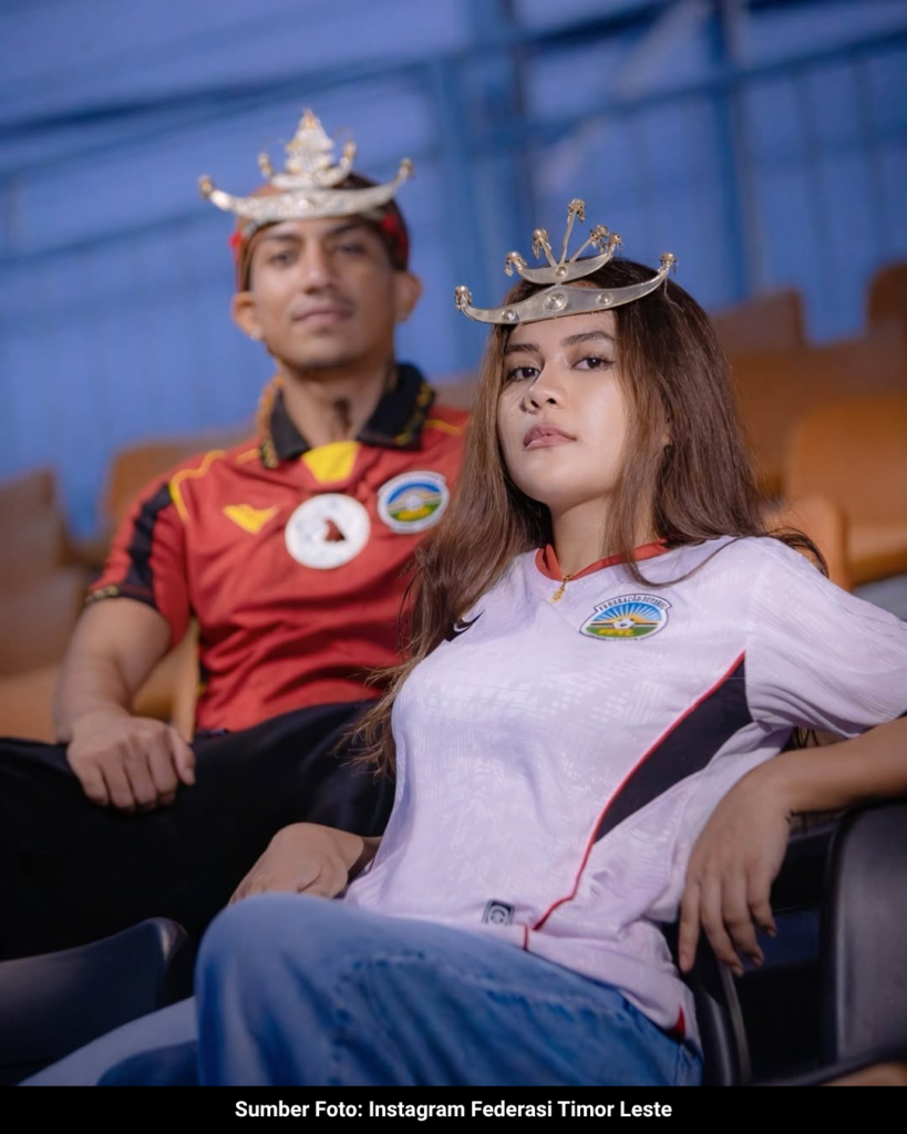
The White Away Kit: 90s Terrace Minimalism
If the home kit is loud, the away variant is a lesson in sharp restraint. Oliver opted for a pristine white base, letting the structural details do the heavy lifting. The highlight is the aggressive, retro-inspired ribbing on the V-neck and sleeve cuffs. The thick black and red banding gives the shirt an instant 90s nostalgic vibe, making it completely terrace-ready.
Upon closer inspection, the white fabric is not flat. A subtle, white-on-white geometric sublimation runs through the core panels. This invisible layer of detailing elevates the piece from a standard blank to a premium, engineered garment.
The Wake-Up Call
The Timor Leste x Oliver drop transcends standard regional merchandising. It is a blueprint. A brand from Central Java flawlessly delivered a premium aesthetic for a foreign nation, raising a glaring question. Why is the biggest federation in Southeast Asia still wearing kits that lack this level of bespoke storytelling? Oliver just set a new standard for local kit culture, proving that independent manufacturing can completely dominate the pitch when given total creative freedom.