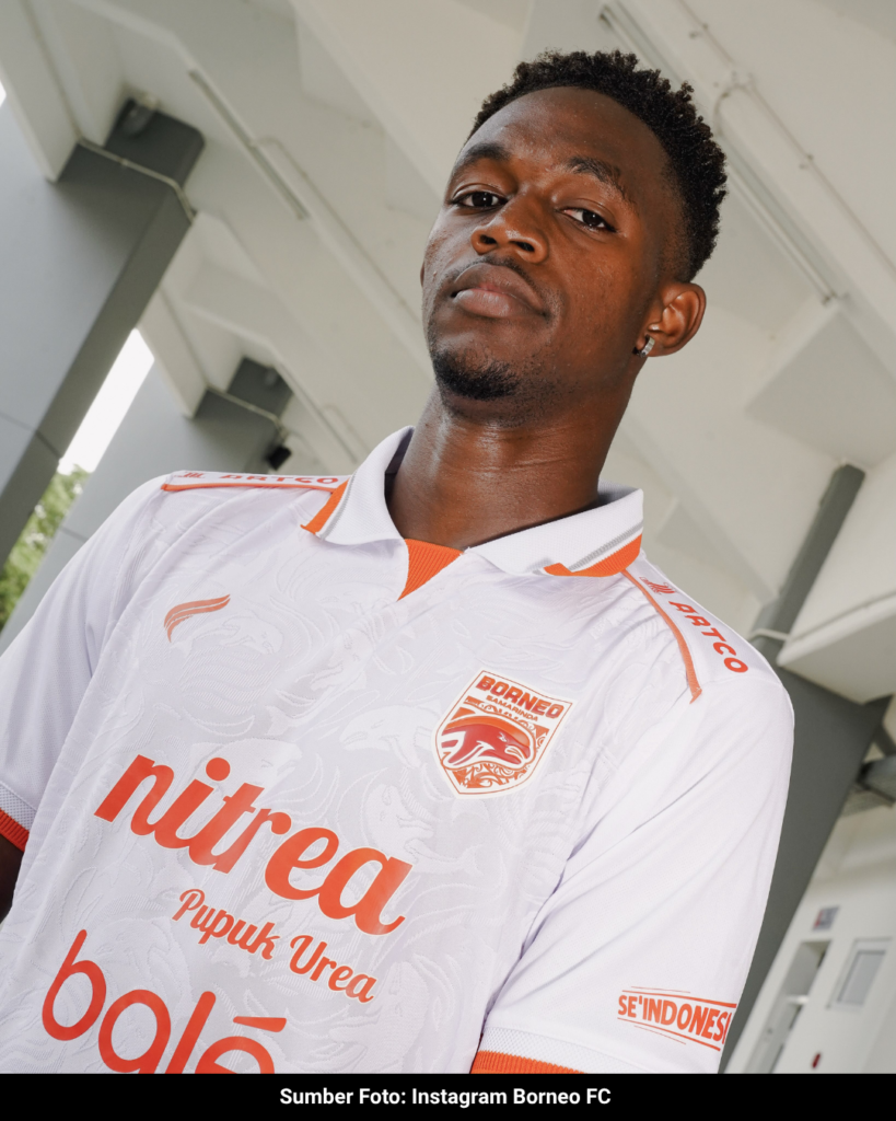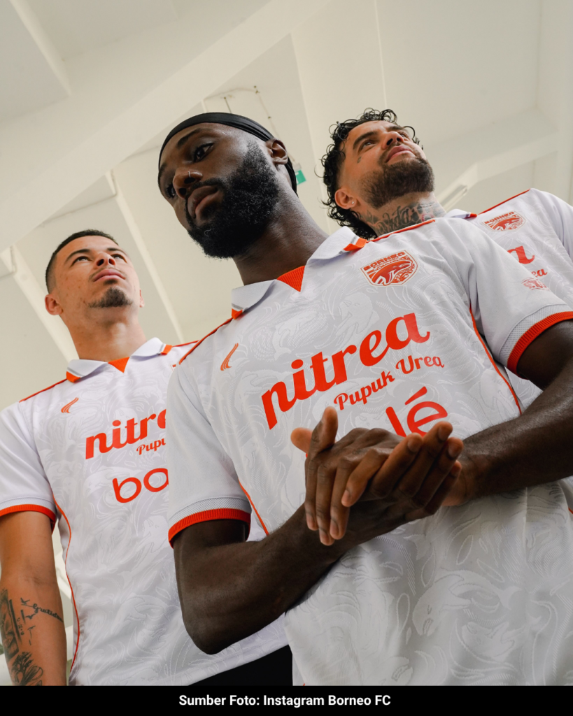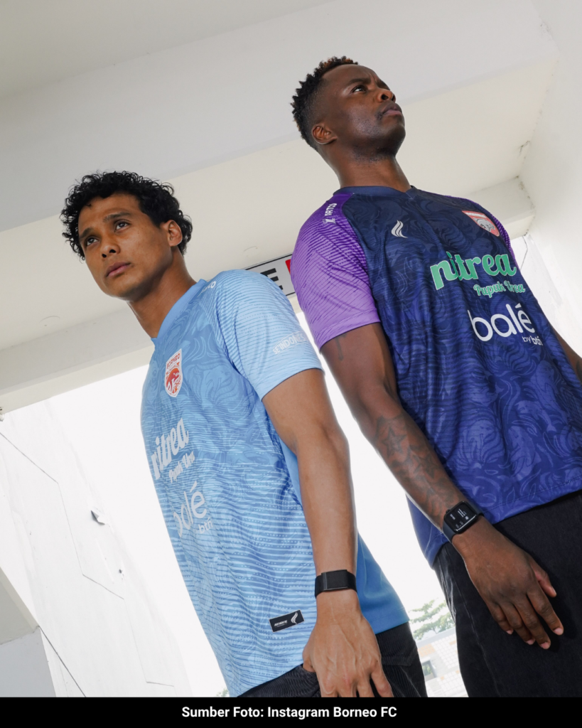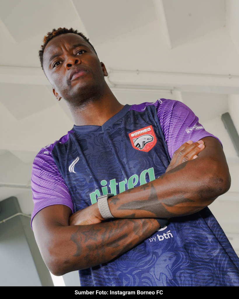


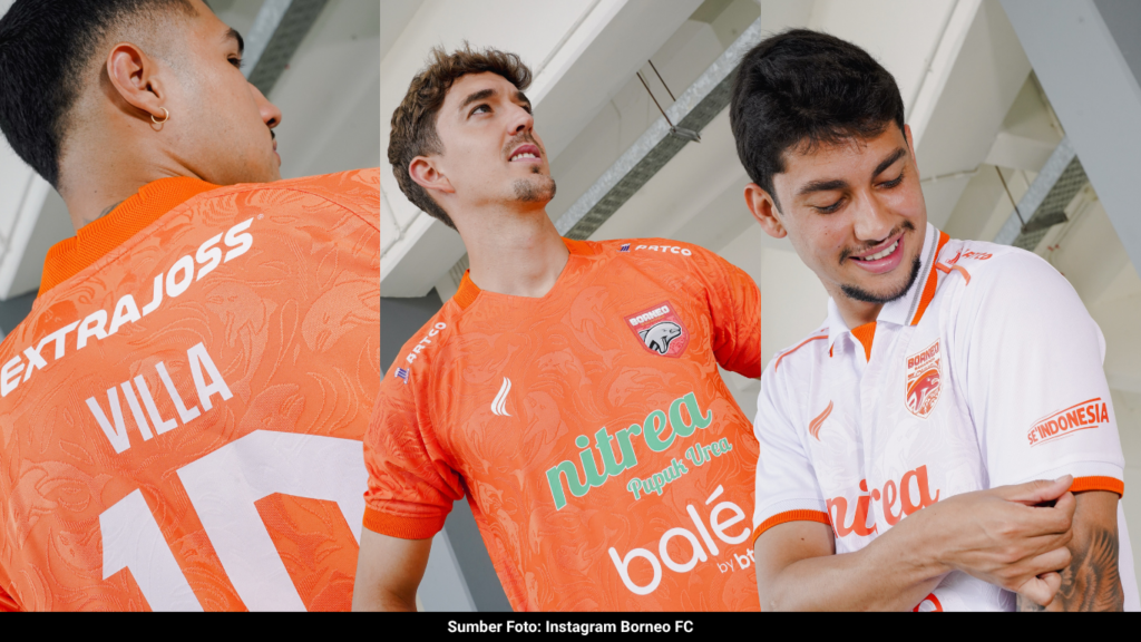
In an Indonesian kit landscape that frequently equates visual complexity with quality, Borneo FC Samarinda takes a deliberately measured route for the 2026/2027 season. The club’s new collection sidesteps the local expectation for hyper-graphic, busy designs, offering a stripped-back aesthetic that prioritizes structure over surface-level noise.
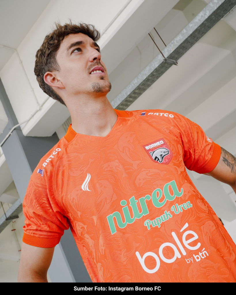
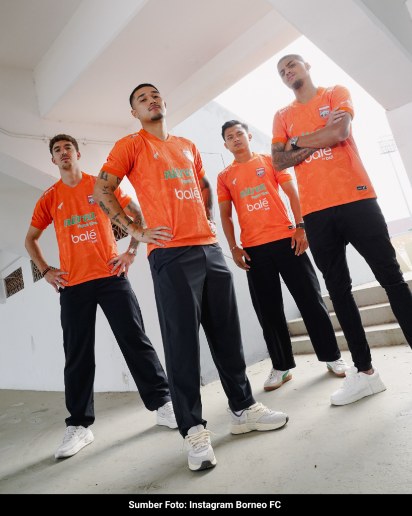
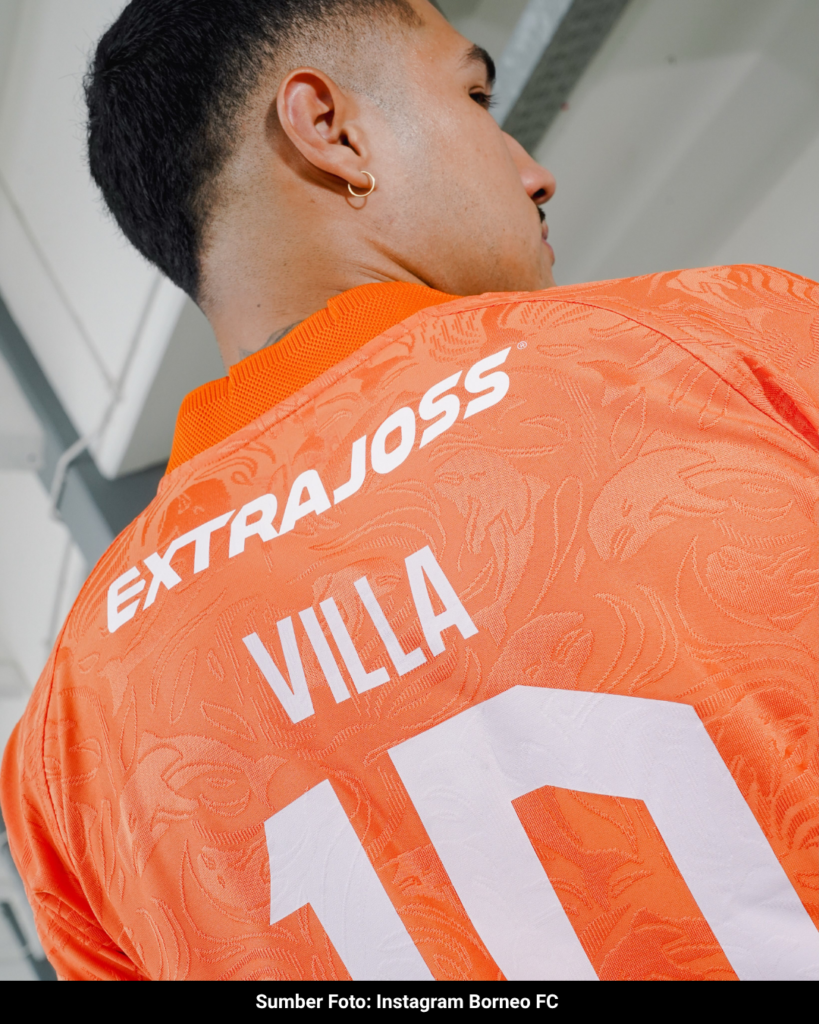
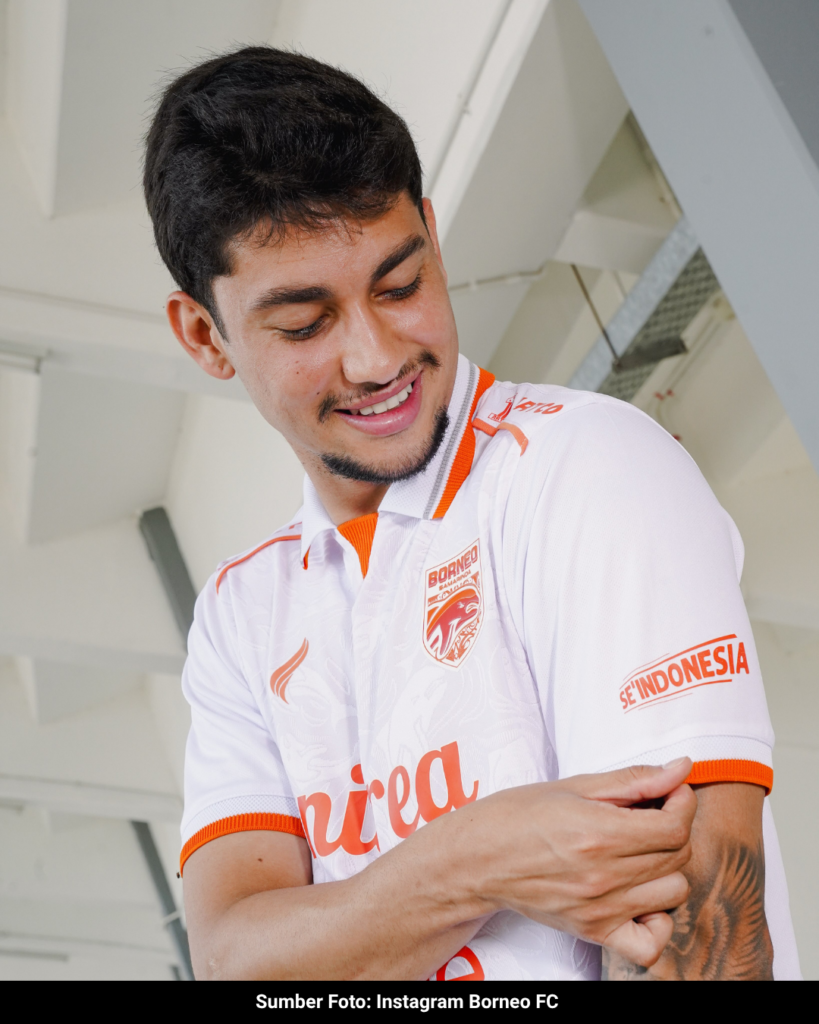
The defining feature across both the orange Home and white Away shirts is a fully tonal jacquard weave. Instead of relying on heavy, contrasting prints, the club’s iconic Pesut Etam (Irrawaddy dolphin) motif is engineered directly into the fabric. This creates a textured, repetitive pattern that covers the entirety of the shirt. It is a calculated design choice that keeps the core identity highly visible upon close inspection, while avoiding the trap of a cluttered canvas from a distance.
That focus on texture is paired with a strictly limited color application. By sticking to a pure, solid orange for the Home and a clean white for the Away, Borneo FC maintains a sharp, traditional look. It is a highly focused approach that proves a club’s identity and the pride of Samarinda can be clearly communicated through refined, simple design rather than relying on visual chaos. Manyala.